
In today's fast-paced business landscape, staying ahead of the competition requires efficient and effective solutions. According to Microsoft’s Work Trend Index, nearly 70% of employee report that they don’t have sufficient time in the day to focus on “work”, with more time being spent Communicating than Creating.
Microsoft 365 Copilot is designed, with Microsoft’s cloud trust platform at its core, to allow for employees to both be more productive, reduce the time spent searching for information, performing mundane tasks, and other low-value activities.
Power BI
In this blog post, I will demonstrate how to consume cognitive services in Power BI Premium, using a publicly available dataset of Amazon music instrument reviews. I want to score the sentiment of the review text and compare that with the number of stars given to any given product. The main purpose of this post is to show at a high-level how to use Azure Cognitive Services in Power BI Premium inside dataflows. A basic working knowledge of Power BI Desktop and the Power BI service is assumed, and access to Power BI Premium with a functioning gateway is required.
Download the Data
Kaggle.com is a great source of experimental data. For the uninitiated, it is an online data science and machine learning community. Within the site, users can find datasets, models, and even challenges/competitions offering cash rewards.
Today, we will be using a dataset of Amazon musical instrument reviews. The dataset, and explanations about where it comes from, what the columns represent, etc. can be found at this URL:
https://www.kaggle.com/eswarchandt/amazon-music-reviews/data#
Click the download button on this page and extract the zip file (I extracted mine to c:\temp). There are 2 different files with the same data, one is a JSON format and the other is a CSV file. For this exercise, we will use the CSV file.
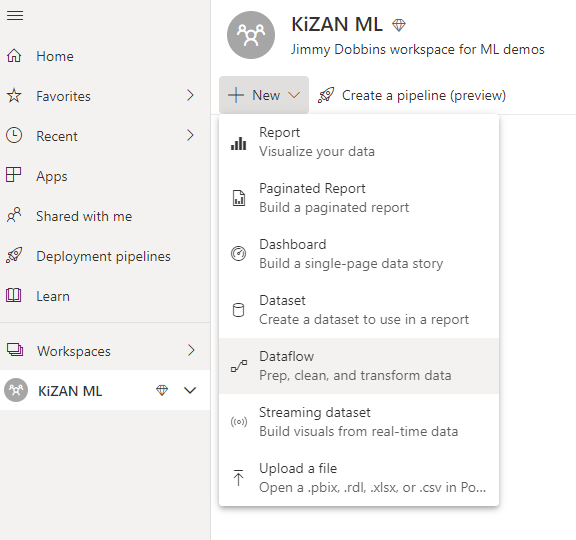
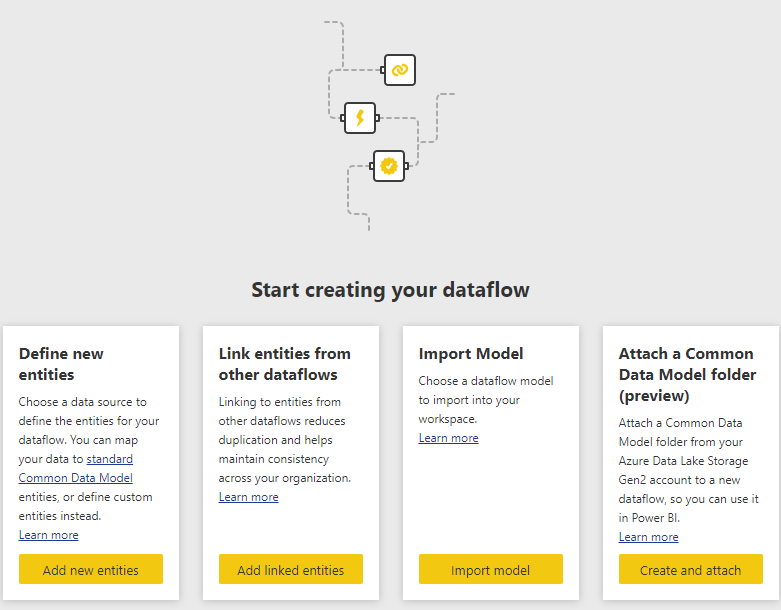
Create Power BI Dataflow
The first thing we need to do is create a dataflow in a Power BI Premium capacity workspace. Go to https://app.powerbi.com, navigate to your selected workspace, and click New -> Dataflow.
On the following page, select “Add new entities” in the “Define new entities” box.
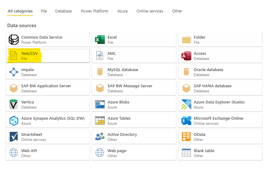
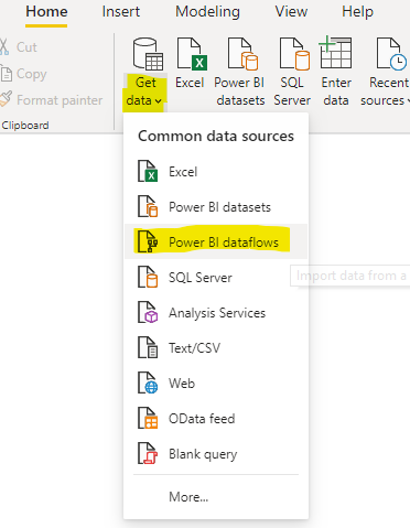
We are now presented with a large selection of tiles representing different data sources Power BI can consume. Select “Text/CSV.”
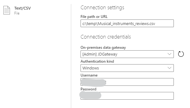
At the following dialog, populate the file path of the CSV file, select the appropriate gateway, and designate authentication credentials to reach the file and click Next.
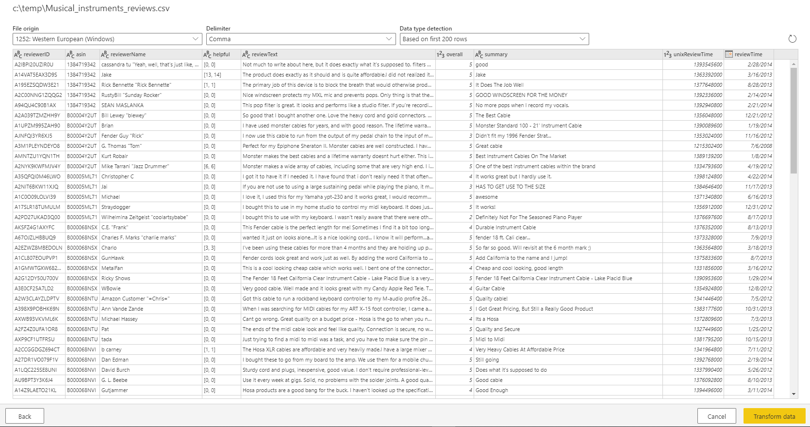
The next page displays a preview of the data (based on the first 200 rows). Click Transform Data to continue into the Power Query Editor interface.
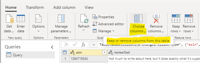
We will now add a few transformation steps to process the data. We should get rid of columns we will not be using. The fastest way to do this is to select the “Choose columns” button and select the columns we want to keep.
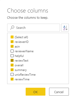
Uncheck the reviewerName, helpful, and unixReviewTime fields then click OK.
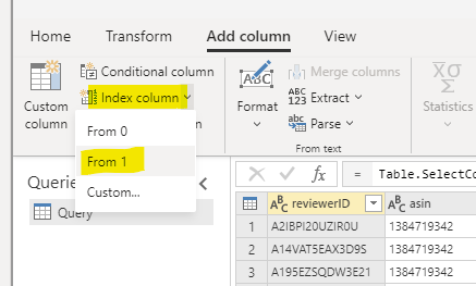
Before we begin our sentiment scoring, it will be handy to have an ID field. To do this, click Add column, then Index Column, and select “From 1” to start the field numbering at 1.
Double-click the newly created column, Index, and rename it to ID. Double-click the query name “Query1” and name it something more descriptive, “AmazonReviews” is what I named mine.
Consume Azure Cognitive Services (AI Insights)
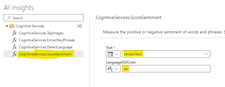
Now we will call Azure Cognitive Services via the “AI Insights” button on the Home tab of the ribbon. Expand the Cognitive Services folder and select the CognitiveServices.ScoreSentiment function. We want to score the sentiment of the review text and specify that the language we will be using is English (code “en”). Click Apply to preview the data returned by the API service.
Once the sentiment labels are returned you will notice that they are decimal numbers ranging from 0 to 1. The higher the number, the more positive the sentiment of the text. Rename the new column ReviewSentiment. Now click the Save & Close button at the bottom of the page to finish the dataflow definition. Power BI will validate the output schemas to make sure the data can be loaded and you will be prompted to refresh the data or set a refresh schedule (the dataflow is empty at this point). Click Refresh Now to populate the dataflow.
Analyze the Data in Power BI Desktop
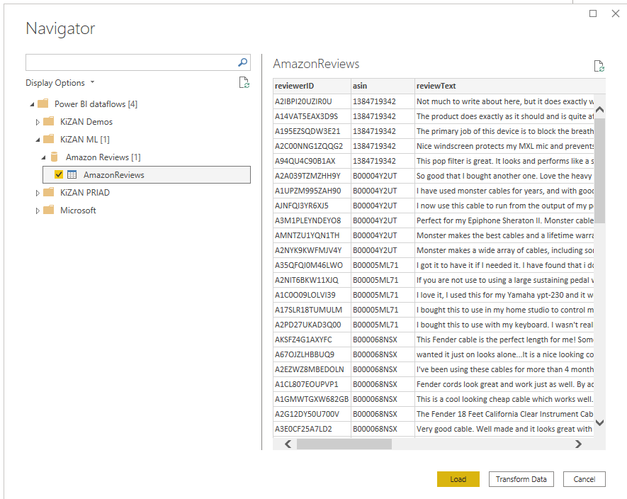
Now we will open Power BI Desktop to look closely at the results of the sentiment scoring. Click Get data and select Power BI dataflows and select the Amazon Reviews dataflow we just created.
The transformations have already been performed in the Power BI service when we defined the dataflow so there is no need to further transform the. Click “Load” to load the data into Power BI.
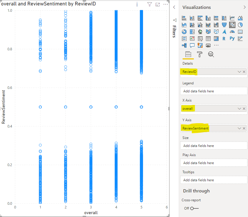
As a simple first visualization, create a scatterplot and put the overall field (this is the number of stars rating) on the x-axis and plot the ReviewSentiment score on the y-axis. We observe a significant split on opposite ends of “neutral” sentiment (a score of 0.5).
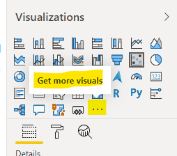
This is not the best visual to understand the data since we cannot determine whether the sentiment score is correlated with the actual number of stars given in the review. We should select a visualization (or visualizations) that can show us the mean, median, and spread in the quartiles (box and whiskers and histograms fit this bill). These are not default visuals so we will need to get them from the marketplace. In the visuals pane, click on the ellipsis as shown in the image below.
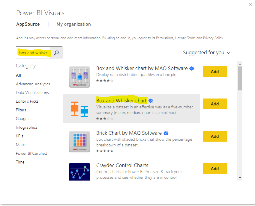
In the next dialog, search for “box and whisker chart” and click Add next to the highlighted result below.
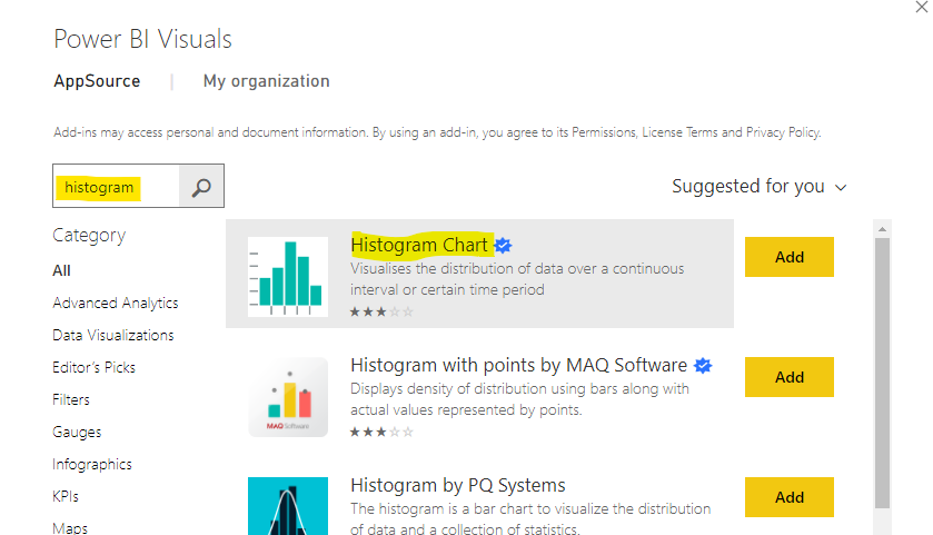
Click OK and confirm that the visual has been added to the report and then repeat this same process for the “Histogram” visual.
Now add a Box and Whisker visualization to the report canvas and populate the field wells (overall as Category, reviewerID as Sampling and Average of ReviewSentiment as Values) as shown below.
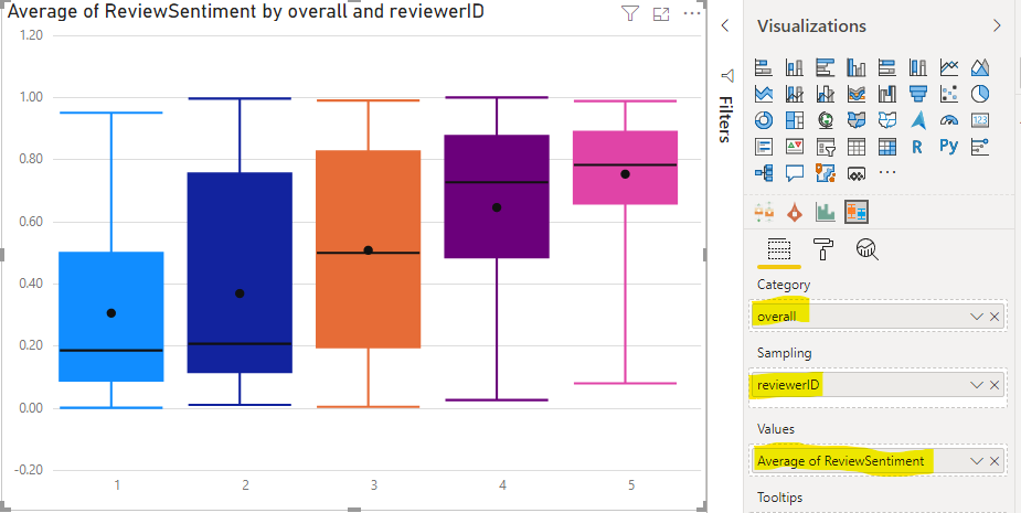
This will create a box and whiskers chart showing each star rating (1-5) on the x-axis, with the interquartile range of review sentiment values on the y-axis. The dot represents the mean and the black horizontal line the median of the review sentiment. The resulting plot shows us that the spread of values is the least for 5-star reviews (the sentiment is glowing for these rating types), followed by 1 and 4-star reviews. Finally, the range of review sentiment scores is much wider for 2 and 3-star reviews.
Drag a histogram visual onto the canvas and drop the ReviewSentiment field into it, then add a table visual to the bottom right of the page (so we can visualize some of the raw data). Rearrange the objects so we can see them all in one view. This is the utility of Power BI for data science and visualization, the ability to see many dimensions and facets of data simultaneously! Add the overall field to the Filters pane (filters on this page) so we can slice by star rating. Your report page should now resemble the following image:
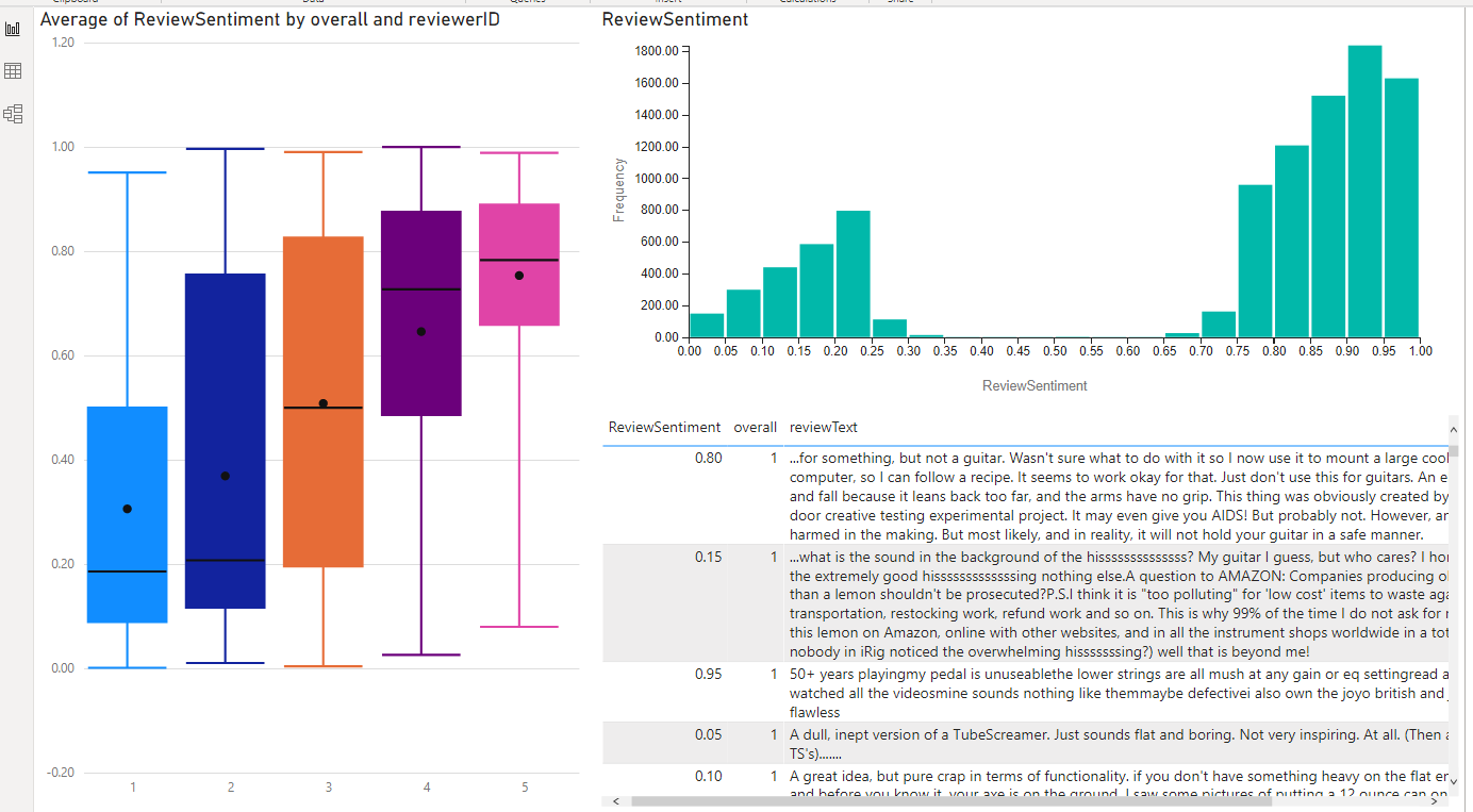
Now we can explore the data by slicing the overall rating, looking at each star rating, and seeing some sample data for different ends of the sentiment score. We can see in the review sentiment histogram that there is a bi-modal (two-peak) distribution. In other words, the algorithm does not return many “middle of the road” sentiment scores.
We can use the features of Power BI to do some interesting ad-hoc analyses. For example, it is interesting to filter the page to 5-star ratings. Use the filter pane to restrict the page to 5-star ratings, then use the histogram to select the lowest sentiment score bin (far left). Then look at the table to understand why the 5-star rating review resulted in a negative sentiment score. In my cursory look, I noticed keywords like “never,” “expensive” and “cheap” being used in the review that may have resulted in the low score. Reading these reviews individually, I can understand why the reviewer left 5 stars (e.g., the reviewer is referring to the value relative to “other expensive brands” or “works well on my cheap guitar”) but the scored sentiment is negative.
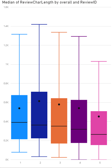
An easy analysis is the length of the review (number of characters). Create a new column, ReviewLength defined as LEN(reviewText). Interestingly enough, “keep it short and sweet” applies to 5-star reviews. The higher the rating, the shorter the length of the review.
Summary
In this blog post, I have demonstrated how to consume AI Insights “out of the box” in Power BI dataflows. This process also works in Power BI Desktop and there are other cognitive services around text analytics we could have applied. Keyword extraction is the most relevant. We could have utilized keyword extraction to understand more about what was being reviewed and how it was used. Using Power BI’s visualization tools and custom visualizations from the marketplace, we form a more complete picture of the data, understanding relationships between sentiment, product rating (number of stars), and length of the review.

KiZAN is a Microsoft National Solutions Provider with numerous gold and silver Microsoft competencies, including gold data analytics. Our primary offices are located in Louisville, KY, and Cincinnati, OH, with additional sales offices located in Tennessee, Indiana, Michigan, Pennsylvania, Florida, North Carolina, South Carolina, and Georgia.