

In today's fast-paced business landscape, staying ahead of the competition requires efficient and effective solutions. According to Microsoft’s Work Trend Index, nearly 70% of employee report that they don’t have sufficient time in the day to focus on “work”, with more time being spent Communicating than Creating.
Microsoft 365 Copilot is designed, with Microsoft’s cloud trust platform at its core, to allow for employees to both be more productive, reduce the time spent searching for information, performing mundane tasks, and other low-value activities.
How to Create Measure Tables, Display Folders, and Organize your Measures in Power BI
Recently while working with a customer I was presented with a challenge that I hadn’t considered before; they have more than 50 measures in a dataset and asked for the best practices around organizing them. After pausing for a bit too long, I said I would get back to them and provide our recommendations. I then proceeded to spend the better part of 2 days agonizing over how to make a simple yet robust system for organizing measures for both dataset developers and report builders.
This blog consists of two main sections, the first being a couple of tips that are easy to start using and will get your datasets organized with minimal time spent, the second section will be taking a deep dive into my organization structure and the reasoning behind it.
So, without any further ado, let’s get into.
Section 1:
80 for 20, or How I Learned to Stop Worrying and Love the Measures
The first thing that everyone should be doing once they have more than a couple of measures in their dataset is create a measure table. And if you take nothing else from this blog post, it should be that measure tables are key for having a well-organized dataset.
A measure table is a way that Power BI interprets a table that has measures but no columns. So what does that actually mean, and how do you make one?
I think that this is best explained by making one, so let’s do that!
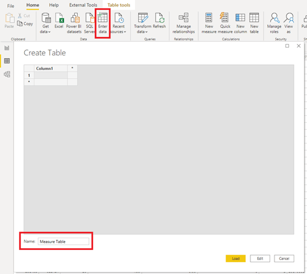
With how important they are, they are very simple to make: Go through the “enter data” dialogue and don’t enter any data (I have given this table a name of “Measure Table” but you can name yours whatever your heart desires):
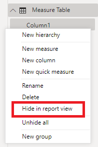
Once you have the new table in your dataset, hide the only column:
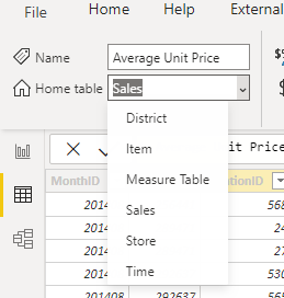
Then start moving your measures to it (this can also be done by dragging and dropping them in the model view):
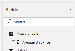
Once you save and reopen your file Power BI will recognize what you are doing and show a different icon for the table, as well as put it at the top of the list in the fields section:
This is where most use cases end, and for every dataset with 10 or so measures, the effort involved in the next steps is probably not worth it. But for those with dragons to slay, I present to you DISPLAY FOLDERS.
Display folders were rolled out quite some time ago now but I had not used them until recently. They allow you to create structures within tables to organize measures. Much like measure tables, these are very easy to start using, but they do come with their own set of annoyances.
To create a display folder, navigate to the model tab on the left side of Power BI Desktop:
Then, from the fields section, select a measure and look at the properties pane:
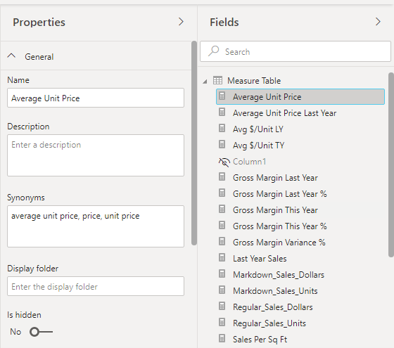
Here you will find the “Display Folder” text box. To put a measure in a folder, just type the name into it:
This is where one of the biggest annoyances of working with display folders lies, there is no ability to select from the folders that already exist in the table. However, it is not all doom and gloom because we can drag and drop measures into existing folders. Additionally, there is actually a feature I didn’t know about with display folders, which is the ability to use sub-folders. When typing in the “Display Folder” box, use “\” to create sub-folders:
This is the key to my organization methodology.
We now wade deeper into the waters with:
Section 2:
How to Make a Mountain out of a Molehill
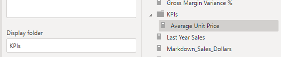
With the problem stated and the solution’s foundation laid, let's get into the organization methodology. First up, I create a folder “KPIs” that contains all of the base measures that are used commonly in reports driven off the dataset. By base measures, I mean measures that will be used in YoY, Variance to budget, and other time/business logic measures. I then create as many of the following folders as needed, depending on the use case:
- Time
- Totals
- Variance
- Labels
- Counts
I’m sure that these are not a comprehensive list of categories that could be needed, but they do offer a good jumping-off point for organizing your own files.
Let's talk specifics on these other folders.
Time:
This folder is used for all of the YoY, Last Year, This Year, etc… measures. If there are more than a couple of these measures in your dataset, I would recommend breaking this into subfolders for the different types of measures you’re using.
Totals:
This folder is used for compound measures that provide high-level metrics. For example, if you had multiple types of expenses that needed to be rolled up into “Total Expenses” then that measure would go here.
Variance:
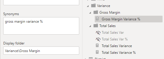
I have a feeling this will be the least oft used category but this structure kept me sane while working with a dataset containing 36 variance measures. I used the source measure as a category, so if I had “Total Sales” in the KPIs folder, I put its variance measures in Variance\Total Sales. I adopted this pattern because I had multiple variance measures per KPI and they were not consistent. If you have consistent variance measures (only 2 or 3 different types of calculation) then I would recommend categorizing based on variance type rather than KPI like Variance\Percentage or Variance\Dollars.
Labels:
This folder is used for text values that are used throughout your report. Whether they be a date range or a selection from a filter, they go here.
Counts:
This folder is used for all of the counts of things that might be in your report. Depending on the use case some count measures deserve to be in the KPIs folder, however, I typically find that counts are more descriptors than actual indicators so I have categorized them differently here. I haven’t had a use case with enough labels to need to subdivide this yet, however, if your dataset has a ton of counts, I would recommend breaking this into sub-folders by source table.
Now, with over 1000 words about organization, we reach our...
Conclusion:
But why…?
As mentioned in the intro to this blog, this all came about because of a dataset that had a bunch of measures in it (I’m sure that tabular model or AS cube developers are scoffing at 50) and needing a way to make them easily usable without having to constantly use the search bar or an external data dictionary. This may seem a bit overwhelming to implement all at once, but it’s not necessary to implement all of this all of the time. You might only need to create a measure table or create a couple of display folders. Hopefully, this blog has helped you determine what you need for your datasets. And while I think that this pattern is fairly robust, you will most likely need to modify it to your given analytics needs. My main objective is to give you a framework to start organizing your datasets and think about their usage.
Speaking of modifying this pattern, my main advice would be to try and boil down the primary usage of the measure being created and categorizing based on that rather than organizing based on source. This will make your dataset easier to use for developers creating reports to find things.
And with that, we have gone from having measures all over the place to creating a measure table and folders, and talking through my recommendations for how to structure those folders.
Power BI: Pilot & Adoption Assistance
Work with KiZAN’s data analytics experts to go from 0 to 60 over a two-week period to build a strong foundation with Power BI. We start by defining your goals for your reporting and enable your employees to visualize and understand the data to help them drive your business.


KiZAN is a Microsoft National Solutions Provider with numerous gold and silver Microsoft competencies, including gold data analytics. Our primary offices are located in Louisville, KY, and Cincinnati, OH, with additional sales offices located in Tennessee, Indiana, Michigan, Pennsylvania, Florida, North Carolina, South Carolina, and Georgia.