
In today's fast-paced business landscape, staying ahead of the competition requires efficient and effective solutions. According to Microsoft’s Work Trend Index, nearly 70% of employee report that they don’t have sufficient time in the day to focus on “work”, with more time being spent Communicating than Creating.
Microsoft 365 Copilot is designed, with Microsoft’s cloud trust platform at its core, to allow for employees to both be more productive, reduce the time spent searching for information, performing mundane tasks, and other low-value activities.
Power BI
Perhaps one of the most crucial steps in creating effective visualization tools in Power BI is modeling your data. As data analysts, our goals are to make data exploration faster, make reports more accurate, and make the data and reports easy to maintain over time. If you model your data correctly, then it makes it possible for these goals to be achievable. With there being so much that goes into data modeling, it can be difficult to know where to start.
In this post, I present 5 tips that can help you model data in a way that can help you be successful in visualizing data in Power BI.
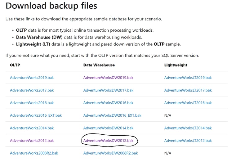
The data we are using is the Adventure Works database from Microsoft’s website. This is a strong foundational database that can help you understand good data modeling practices, as well as get experience working with multiple tables. You can download this data by going to the following link: https://docs.microsoft.com/en-us/sql/samples/adventureworks-install-configure?view=sql-server-ver15&tabs=ssms. Select the AdventureWorksDW2012.bak file when choosing which database to download, as seen in the picture below.
Create a Star Schema Model
The first step to modeling your data effectively is to simplify it. While star schemas are not the only solution, it is a popular method that can help logically organize your data. In a star schema, each table within the data is defined as a dimension or fact table. The fact tables contain data values for certain observations or events. In most cases, fact tables have columns that contain numbers or dates and are typically keys throughout the data. The dimension tables are used to group the data from the fact table and create relationships. In most cases, dimension tables contain the unique values within the data, and they tend to be smaller than the fact tables which contain numerous events. An example of a star schema can be seen below:
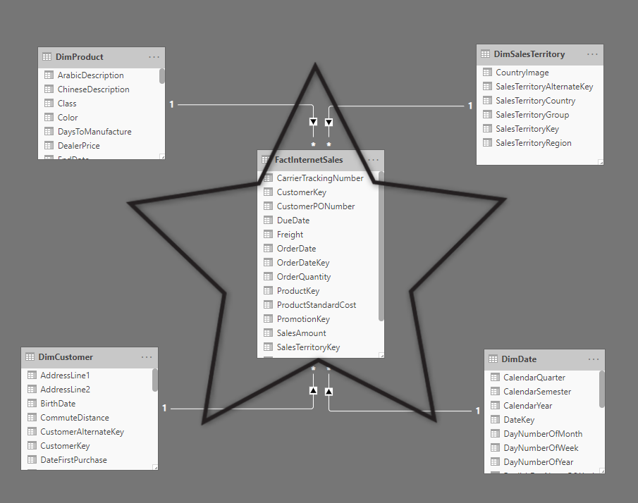
You can create a star schema in Power BI by configuring your data model and creating relationships between your fact table and dimension tables. You create these relationships on identification keys such as the example above. We can see that the DimSales Territory table is related to the FactInternet Sales table through the SalesTerritoryKey attribute. This relationship ties the DimSales Territory table not only to the fact table but to the other tables related to it as well. In the Adventure Works database, we can see the star schemas that have been created. You can see all the dimension tables are linked to a fact table that holds a key that relates them to one another.
It is good practice to view the Manage Relationships area on the Modeling ribbon in order to create, edit, manage, and delete relationships as needed.
Define Data Granularity
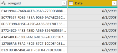
When creating relationships, you will run into problems with data granularity. Consider that you are working with sales data and need to create a chart using multiple tables. The sales table calculates the date of the sale in low detail such as 06/11/2020, 07/11/2020, and 08/11/2020. The order table calculates the date on a monthly level such as 06/2020 or 07/2020. These tables have a different level of granularity, which will cause issues when you attempt to build relationships between them. In this scenario, you could use the year and month columns in the order table to mirror the date format in the sales table. You could use CONCATENATE to make this change, and it would allow you to successfully create a relationship between the two tables. The example can be seen in the images below:
This is just one example of defining the granularity in your data. As your data becomes more extensive, it can be easy to find yourself digging through the weeds and trying to find which data points are the most meaningful to you. Therefore, it is crucial to maintain your data’s granularity in order to leverage the specific areas that your business is trying to focus on. In some cases, summarizing the granularity can be beneficial as it allows your reports and visuals to function faster, but it might not let you drill as far into the data as you want.
Defining the granularity is a balancing act, but it is an important part of the data modeling process.
Create Hierarchies in Dimension Tables
There are several ways to focus on the granularity of your data, but one key data modeling technique is using hierarchies within Power BI. You can use hierarchies as one simplified piece of data that helps you find the detail within a dimension table. They can be formed through layers or segments of your data. A great example of using a hierarchy to simplify data is using the date values within a data model. There is an increasingly high demand for data that shows trends over certain periods of time (fiscal year, quarters, etc.). Power BI will automatically create a hierarchy whenever you drag one attribute from a table and drop it onto another. In the example below, we can see that we created a hierarchy using date values as discussed above:
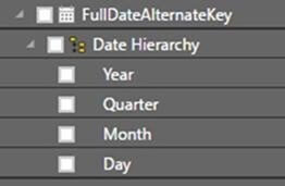
We can see that the created hierarchy above shows the Year, Quarter, Month, and Day. The main advantage that this hierarchy gives us is the ability to drill down into the data for additional relevant details. This allows you to get a more detailed perspective of your data and add more to the stories that your visualizations tell. While we use the date example here, several other attributes can give more meaningful data when placed into a hierarchy. You could look at product categories and then drill down and view which products are driving your revenue, or you could look at a map hierarchy and drill down to see which areas are key influences. You can quickly see how creating these hierarchies in your dimension tables early on will help you in the long run.
Understand and Work with Cardinality
Cardinality in Power BI refers to the types of relationships within your data, as well as the filtering involved between tables.
An important part of managing and creating these relationships when modeling your data is understanding which types of relationships your data has and making sure that Power BI reflects those in the Manage Relationships window. Many-to-one or one-to-many cardinality describes a relationship in which you have many instances of a value in one column that are related to only one unique corresponding instance in another column. It normally describes the directionality between the fact and dimension tables. An example can be seen below:
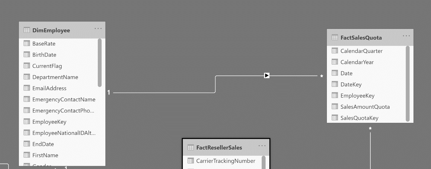
In this example, the DimEmployee table has one unique value for each employee within the data and they are related to many instances of their name the FactSalesQuota table.
The next type of cardinality is known as one-to-one cardinality. It describes a relationship in which only one instance of a value is common between two tables. It requires unique values in both tables that are creating the relationship. An example can be seen below:
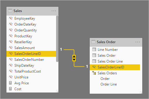
This example isn’t in the Adventure Works database, as it doesn’t contain one-to-one relationships. Here, the Sales table has one unique value for each sales order line within the data and they are related to their unique value in the sales order table. These types of relationships are less common but are still important in assuring your data is being utilized correctly.
The last type of cardinality is known as many-to-many cardinality. It describes a relationship where many values are in common between two tables. It does not require unique values in either table in a relationship. An example can be seen below:
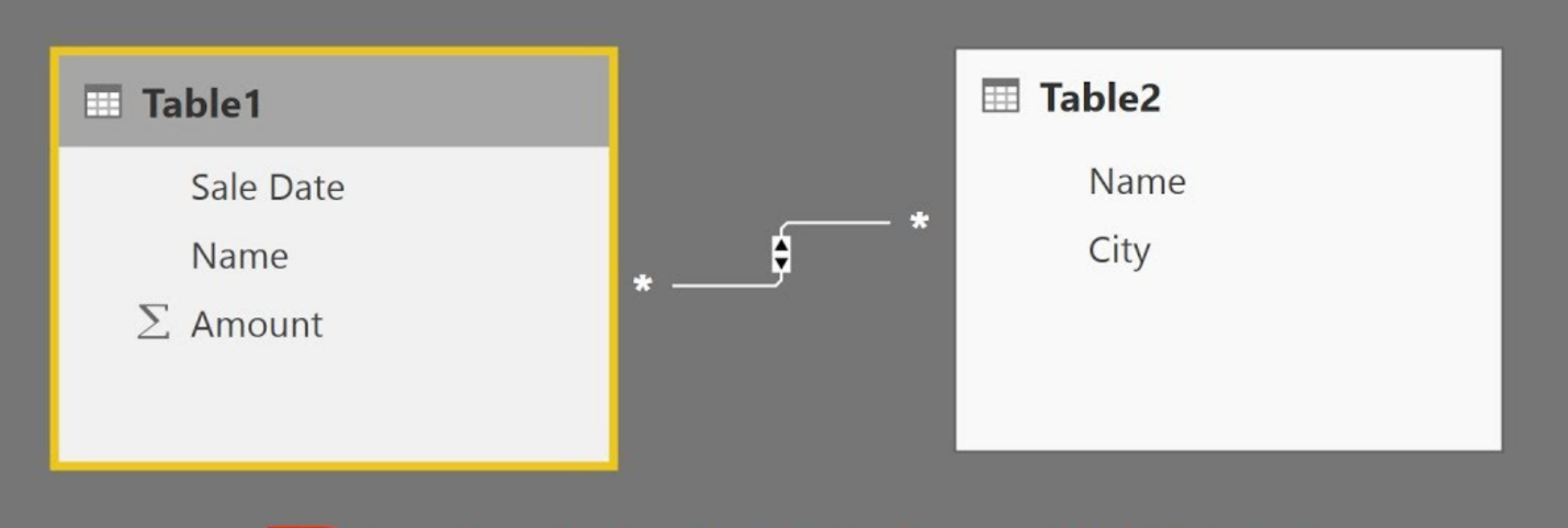
This example isn’t in the Adventure Works database either, as it doesn’t contain many-to-many relationships. In this instance, table 1 has many values for the names within the data and they are related to many values of the names in table 2. These types of relationships aren’t recommended because the lack of unique values can confuse users when they are trying to keep track of what columns the data is addressing.
Understanding these relationships is important when building your data model. While Power BI does autodetect relationships, it is still important to manage your relationships and make sure you are modeling your data effectively.
Optimize Your Model’s Performance
One last tip, but perhaps the most important one, is to focus on optimizing the performance of your data model. Primarily, performance issues when running your reports are a result of a poor data model behind the scenes. There are several simple, but important areas that you can focus on when modeling your data to ensure that it performs at a high level.
1. Ensure that correct data types are used
If your data types don’t correctly reflect the data you are working with, then this can cause a multitude of issues in creating your model. Having the correct data types allows you to have a consistent format in your data and allows you to optimize performance when creating calculations or measures.
2. Delete unnecessary columns and rows within the data.
This tip is self-explanatory, but the more data that your model is having to load, the slower the performance will be. Therefore, it is best practice to go through your data and delete columns and rows that aren't needed to tell your story in Power BI.
3. Summarize data when possible.
This ties in with some of the tips we have already discussed, but it can be beneficial when you summarize data when the option is available. The more you summarize your data into categories or tables, the less computing power is required for Power BI to run your data model. Again, you want to be careful to not summarize too much, as it could prevent you from having the detailed data that you are looking for.
Summary
This post has highlighted some key areas that you can focus on in helping to build an effective data model within Power BI. These are good steppingstones for anyone beginning to build out their data model for their Power BI enterprise. Using these steps will allow individuals to create visualizations with stronger performance and accuracy and will help them to meet the needs of the different use cases their business presents.
 KiZAN is a Microsoft National Solutions Provider with numerous gold and silver Microsoft competencies, including gold data analytics. Our primary offices are located in Louisville, KY, and Cincinnati, OH, with additional sales offices located in Tennessee, Indiana, Michigan, Pennsylvania, Florida, North Carolina, South Carolina, and Georgia.